Balloon color combinations and palette ideas

The best balloon color combinations start with one main color, add one or two partners from the color wheel, and finish with a neutral or a metallic. Try yours on an arch, garland or column in the tool below, then read on for palette ideas by occasion, age, season and mood.
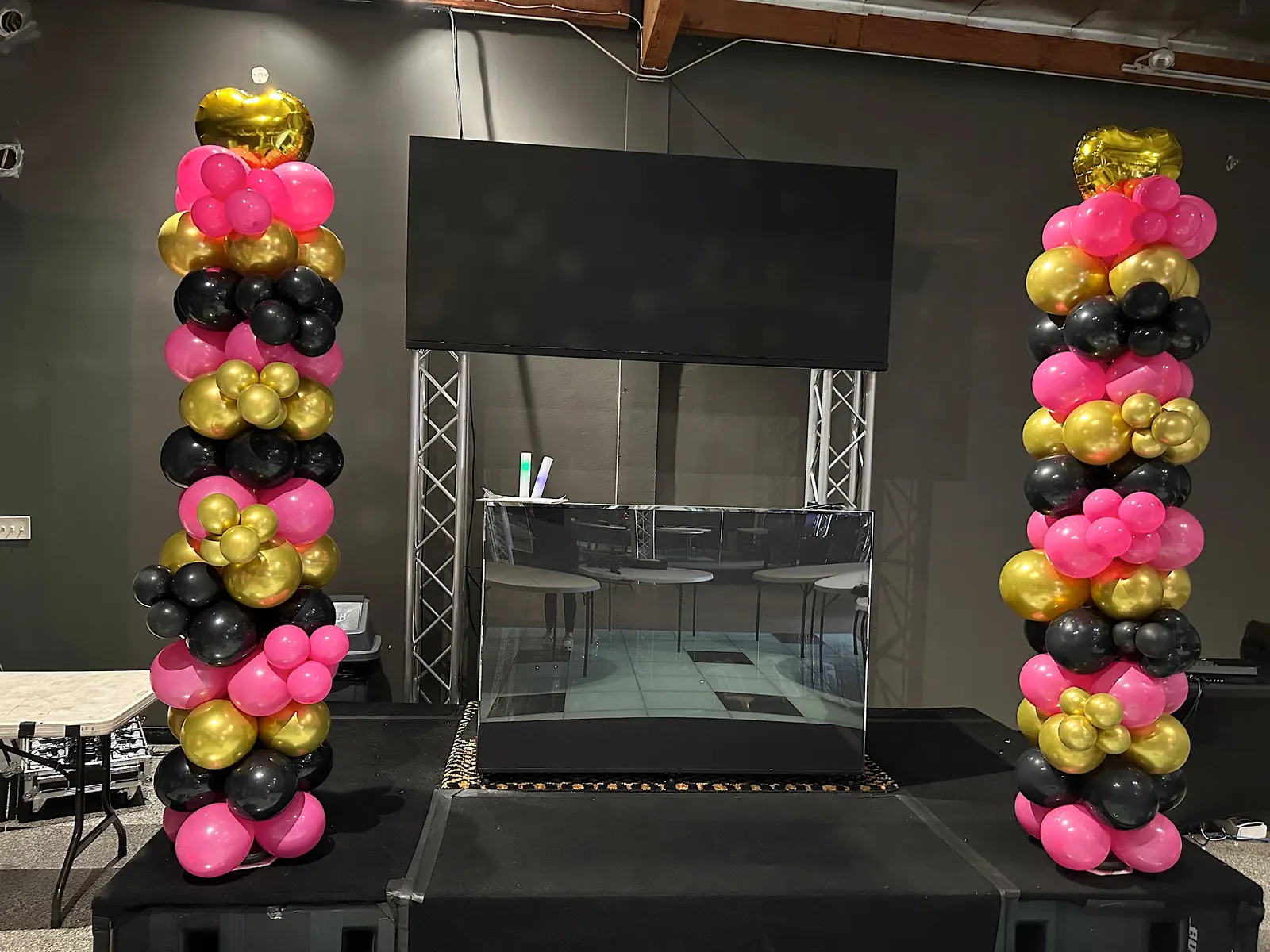
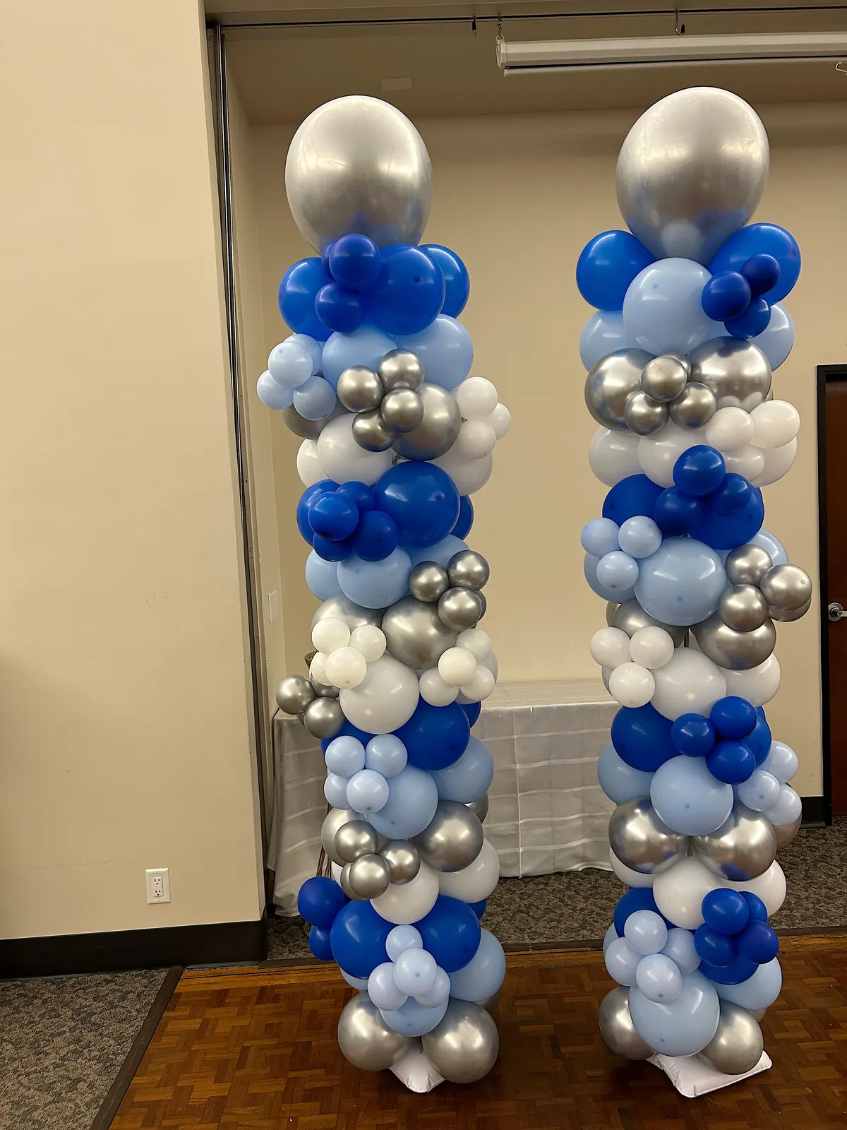
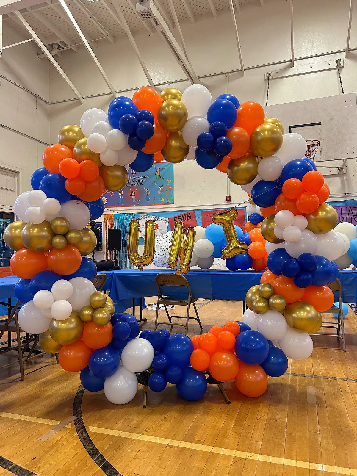
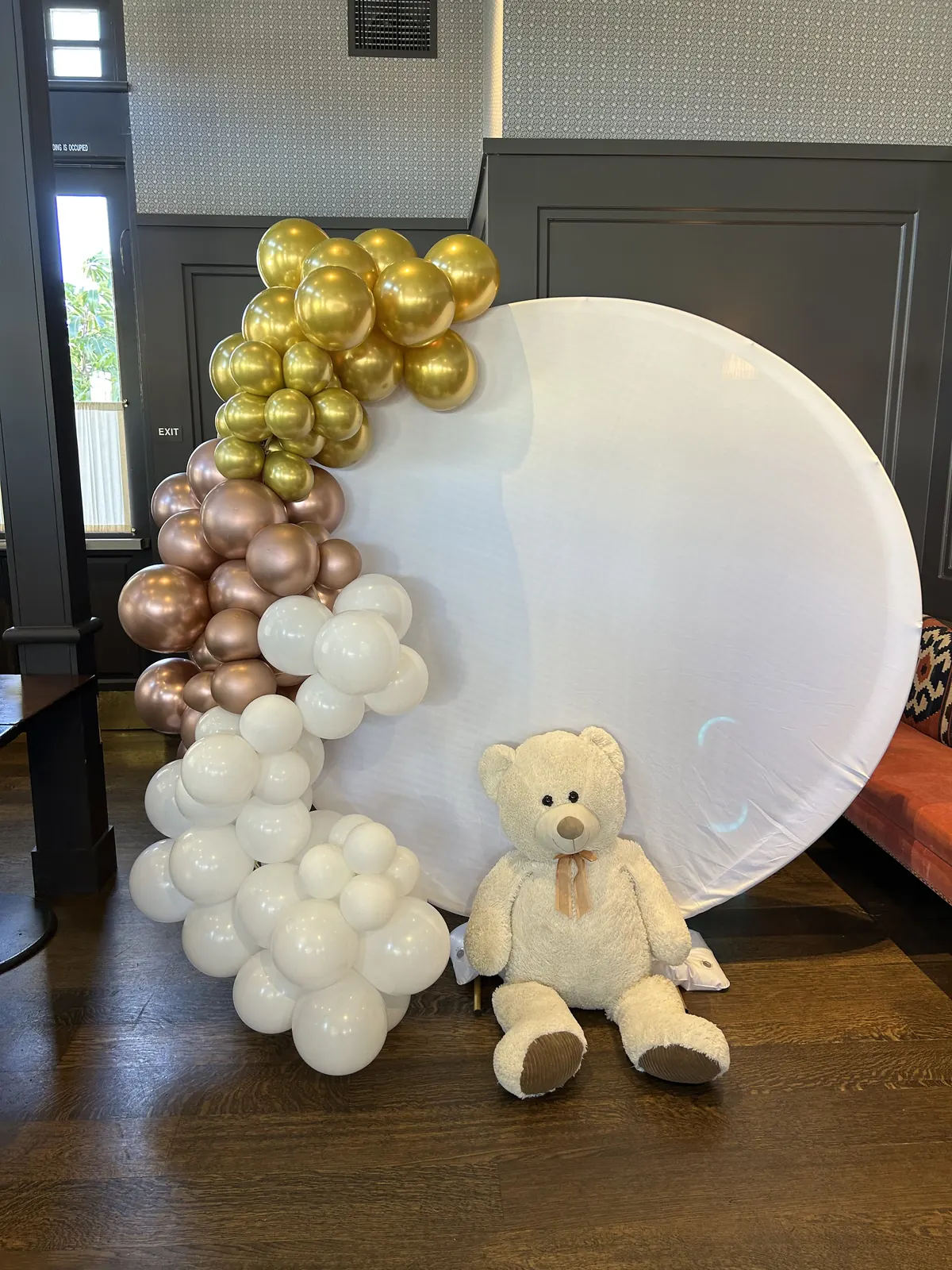
Pair of hot pink, black and gold balloon columns on a stageTwo balloon columns in royal blue, light blue, silver and white at a Los Angeles eventBlue, orange, gold and white circular balloon arch in a school gymRound white backdrop with gold, rose gold and white balloons and a teddy bear

Try balloon colors on real decor shapes

Start from a ready-made palette or pick your own colors, then switch between shapes to see them on real decor. Your first color is used the most and your last color the least, the way decorators balance a palette. Clear starts over, and Surprise me suggests colors that go together.

Inspiration, not a color match

Screen versions of common balloon colors. Real balloons vary by brand and look different in person. Not every color is in stock at all times, but Batel can order the ones your event needs.

1Choose a shape

Your colors

Not sure where to start? Surprise me picks colors that go together, using the color wheel.

2Choose colors

How to choose balloon colors in three steps

  1. Start with one colorPick the color you love most, or the one your invitation, cake or outfit already uses. That is your main color.
  2. Add partnersPick colors next to it on the color wheel for a calm look, or across from it for energy. Two or three colors is plenty.
  3. Finish with a neutralWhite, cream, gold or silver gives the eye a rest and ties everything together.

How many colors should balloon decor have?

Three colors is the safest choice for an arch or garland: one main color, one supporting color and one accent. One or two colors can look even more striking when you mix balloon sizes, because the shape of the decor does the work.

Minimal

One color

Sage

Modern and clean. Mixed sizes of one color give an organic garland texture without any busy mixing.

Clean

Two colors

Navy and Gold

Clear and graphic. Great for school colors, a brand or a strong theme. Keep one color a little stronger than the other.

Balanced

Three colors

Sage, Cream and Gold

The most balanced choice. Roughly half main color, a third second color and a touch of accent.

Rich

Four colors

Pastel pink, Baby blue, Lilac and White

Rich and layered. Keep the four colors in the same tone group, or make one of them a neutral.

Simple color rules that always work

Designers use a handful of simple rules from the color wheel, and Surprise me in the tool uses the same ones. Each rule gives a different feeling, so you can choose the feeling first and the colors second. Colors from the same tone group, all pastel or all deep for example, always sit well together.

Also called analogous

Next-door colors

Coral, Mango and Watermelon

Colors that sit side by side on the color wheel. Smooth, easy on the eye and hard to get wrong.

Also called complementary

Opposites

Royal blue, Orange and White

Colors from opposite sides of the wheel. The strongest contrast, full of energy. Add white so they do not clash.

Also called split complementary

Soft contrast

Sage, Mauve and Dusty rose

One color with the two neighbors of its opposite. Bold, but softer than straight opposites.

Also called triadic

Color trio

Hot pink, Turquoise and Yellow

Three colors spaced evenly around the wheel. Playful and balanced, perfect for kids.

Also called tonal

Shades of one color

Navy, Sapphire, Baby blue and White

Light and dark versions of one color. Calm, polished and very photogenic.

The easy one

One color plus neutrals

Emerald, Cream and Gold

Let a single color lead and add white, cream or a metallic. Simple and elegant.

Balloon color ideas by occasion

Start from the occasion and the people in the room. A kids party wants color you can see from the door. A shower or a wedding wants softer tones that look good in photos. These palettes are starting points, and every one of them can be changed in the tool.

Kids birthdays

Hot pink, Turquoise, Yellow and White

Kids love strong color. Take two or three colors from their favorite character or toy and add white so it stays cheerful, not chaotic.

First birthdays

Peach, Cream, Sand and Gold

Soft colors keep the attention on the baby in every photo. A little gold makes it feel like a celebration.

Baby showers

Sage, Cream, Sand and Gold

Neutral palettes work when the baby is a surprise. For a girl or a boy, swap sage for pastel pink or baby blue.

Gender reveals

Pastel pink, Baby blue, White and Gold

Use pink and blue in equal amounts so nobody can guess. White and gold keep it looking dressy.

Bridal showers and weddings

Blush, Cream and Champagne

Blush, cream and champagne suit almost any wedding. Match one color to the flowers or the bridesmaid dresses.

Bar and bat mitzvahs

Navy, Silver and White

Many families start from the teen’s favorite color and add one metallic. Navy and silver or burgundy and gold both look grown-up.

Graduations

Navy, Gold and White

School colors plus white or a metallic. If the school colors clash, let one lead and use the other as the accent.

Quinceañeras

Dusty rose, Rose gold, Champagne and White

Match the dress. Soft pinks with rose gold feel romantic, while ruby or emerald with gold feels regal.

Corporate events and grand openings

Royal blue, White and Silver

Your brand color plus white and one metallic. Balloons come in set shades, so a brand color is matched to the closest one.

Hanukkah

Royal blue, Baby blue, White and Silver

Blue and white with silver is the classic. Add gold if you want it warmer and more festive.

Anniversaries and milestone birthdays

Black, Gold and White

Black and gold is the classic for a 30th, 40th or 50th. For a softer look try champagne, cream and gold.

Holiday parties

Ruby, Emerald, Gold and Cream

Deep jewel tones with gold feel festive without looking like a costume. Cream keeps it light.

Balloon colors by age

Age changes what feels right. Little kids love bright, simple color, teens often want something that looks good on their phone, and adults usually lean toward fewer colors with a metallic.

Ages 1 to 3

Babies and toddlers

Pastel pink, Mint, Pastel yellow and White

Pastels or a soft rainbow. Gentle on the eye and lovely in family photos.

Ages 4 to 8

Young kids

Red, Yellow, Royal blue and White

Primary brights or their favorite color three ways. Big, simple color reads as fun.

Ages 9 to 12

Tweens

Hot pink, Orange and Lilac

Trendier mixes like hot pink with orange, or pastels with one bright pop.

Teens

Teens

Black, Silver and Lilac

Black, white and metallics, or light and dark shades of one bold color. Think of how it will look in photos.

20s and 30s

Twenties and thirties

Terracotta, Sand, Cream and Sage

Earthy neutrals, sage and terracotta, or a single statement color with gold.

40 and up

Milestones for adults

Burgundy, Gold and Cream

Fewer colors and more shine: black and gold, burgundy and gold, or navy and silver.

Seasonal balloon color palettes

Seasonal palettes borrow from what is outside the window. In Los Angeles the light matters as much as the weather: strong midday sun makes pastels look even lighter, so an outdoor daytime party benefits from one deeper color. Warm evening light makes gold glow and softens cool blues.

Spring

Mint, Pastel yellow, Pastel pink and White

Fresh pastels with white. Mint and pastel yellow feel like the first warm day.

Summer

Turquoise, Coral, Mango and White

Juicy brights, citrus and pool blues. Great for backyard and beach parties.

Fall

Rust, Mustard, Burgundy and Cream

Autumn spice colors with cream. Add caramel or sand for a softer version.

Winter and holidays

Emerald, Ruby, Gold and White

Jewel tones with gold, or icy blue, white and silver for a winter look.

Balloon palettes by mood

If you know how you want the party to feel, the colors follow. Pick the mood first, then adjust the shades to your theme.

Playful

Hot pink, Yellow, Turquoise and Orange

Bright, saturated and a little loud. Four colors from the brights group.

Elegant

Black, Gold and White

Few colors, strong contrast and a metallic. Always looks dressed up.

Calm

Sage, Eucalyptus and Cream

Soft greens and cream. Quiet, natural and easy on the eye.

Bold

Royal blue, Orange and White

Complementary colors side by side. The contrast makes the decor pop from far away.

Romantic

Blush, Dusty rose, Rose gold and Cream

Dusty pinks with rose gold. Soft, warm and very photogenic.

Earthy and boho

Terracotta, Sand, Sage and Cream

Warm neutrals with terracotta and sage. Pairs well with pampas and wood.

Venue, light and photos

Look at the room first

Balloons that match the wall disappear into it. White balloons on a white wall lose their shape, and navy balloons in a dark room fade away. Make sure at least one color stands out from the background. Use the Dark room switch in the tool to see the difference.

Think about the light

Daylight shows colors most truly. Indoor evening light is warmer, so whites look creamy and blues look a little softer. Metallic balloons pick up whatever light is around them, which is why they look so good at night.

Plan for the photos

Most balloon decor is really a photo backdrop. Mid-tone and deeper colors keep their shape in photos better than very pale ones, and one neutral in the mix flatters skin. If you have an outfit, a dress or a cake color in mind, build the palette around it.

Matching brand or school colors

Latex balloons come in set shades, so a brand or school color is matched to the closest standard balloon color rather than mixed to order. Send your colors, a logo or a photo with your quote request.

Palettes from our own work

The photos at the top of this page show four palettes from Boom Balloon decor in Los Angeles: hot pink, black and gold on a pair of columns; royal blue, light blue, silver and white columns; blue, orange, gold and white on a circular arch; and gold, rose gold and white around a round backdrop. See more on the balloon arches and balloon garlands pages.

Questions about balloon colors

What balloon colors go well together?

Colors from the same tone group always work, for example all pastels or all jewel tones. Beyond that, pick neighbors on the color wheel for a calm look or opposites for contrast, and add a neutral like white, cream or gold.

How many colors should a balloon arch or garland have?

Three colors is the easiest to get right: a main color, a second color and an accent. Two colors look graphic and clean, and four look rich as long as one of them is a neutral.

What colors go with gold balloons?

Almost everything. Black, white and cream are the classics, and gold also looks great with navy, emerald, burgundy, blush and sage.

What balloon colors are good for a baby shower?

Soft pastels like pastel pink, baby blue or mint, or neutrals like sage, cream and sand with a little gold when the baby is a surprise.

Can balloons match my brand or school colors exactly?

Not exactly. Latex balloons come in set shades, so each color is matched to the closest standard balloon color.

Do you have every color in the tool?

Not every color is in stock at all times, but Batel can order the colors your event needs. Tell us your combination in your quote request.

Are the colors in the color tool exact?

No. The tool is for inspiration. It shows screen versions of common balloon colors, and real balloons vary by brand and look different in person. Use it to choose a direction, then tell us the combination you like.

Decor for your colors
Installed prices include delivery, setup and breakdown anywhere in our area, from Pico-Robertson and Beverly Hills to the Valley, Downtown and the beach cities. Outside it, a $120 travel fee covers the delivery and teardown trips.

Prefer to set it up yourself? Most pieces come as Grab & Go: we build it in your colors, you pick it up in Pico-Robertson, for about 40% less.

See balloon garlands vs. balloon arches, how to plan balloon decor, or read more guides.

Get a quote